Web Building
The homepage isn’t the front door you think it is
Most visitors never see your homepage first. They land on a blog post, a product page, a link a friend sent. Design for the side doors.

Most visitors never see your homepage first. They land on a blog post, a product page, a link a friend sent. Design for the side doors.
A client once spent three months perfecting a homepage. Beautiful hero, considered story, every word fought over in meetings. Then we opened the analytics together. Barely a third of visitors had ever seen it. The rest arrived on a blog post, a pricing page, a deep link a friend had sent, and they made up their minds from there, on pages nobody had given the same care to.
The homepage was the front door. Almost everyone came in through a window, and we had spent the whole budget polishing the door.
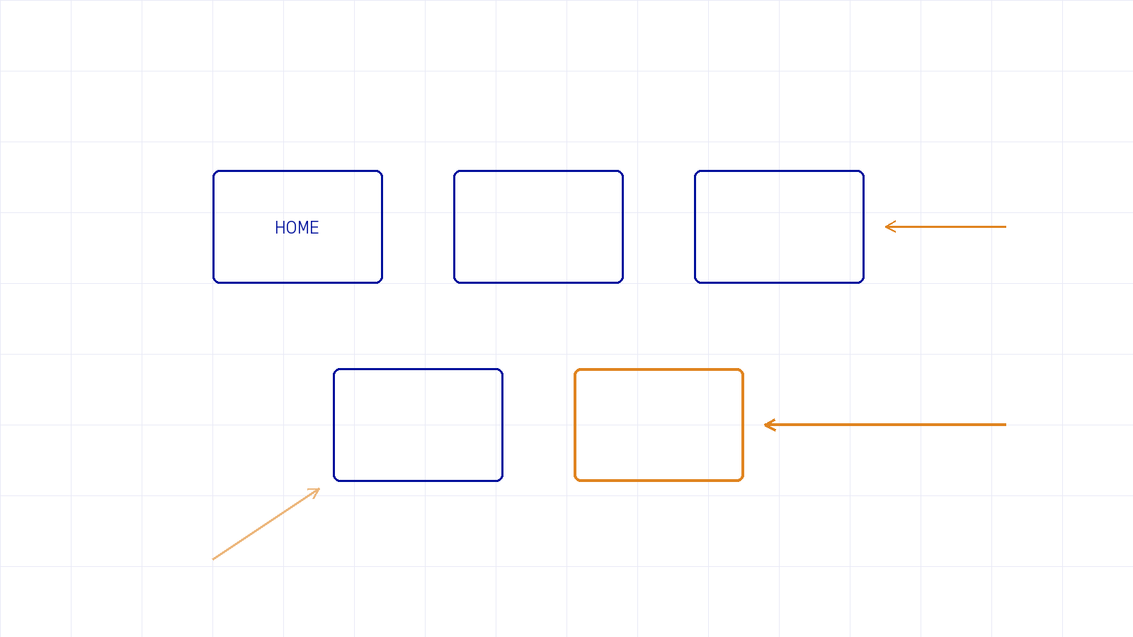
Once you accept that, design changes. A person who lands cold on a deep interior page has no context, no memory of your nav, no idea who you are yet. They didn’t walk through your carefully sequenced story. They teleported into the middle of it. So every page has to quietly answer three questions on its own, without the homepage there to set them up:
Design your interior pages as if each one might be the only page someone ever sees. For most of your visitors, it is.
The practical version of this is the orphaned page: a service detail, an old blog post, a case study that someone lands on from search with zero surrounding context. If it has no clear identity and no next step, it converts nobody and quietly leaks the visitor back to Google. Multiply that across a whole site and you’re losing people in rooms you never think about, because you only ever enter through the front door yourself.
Two habits fix most of it. First, put a light, consistent frame on every page, a clear header, a way home, a relevant next action, so no page is ever truly stranded. Second, treat internal links as part of the design, not an afterthought: every page should offer two or three genuinely useful places to go next. That’s also a big part of why a slow page hurts so much, a topic I got into in speed is a feature your client will never ask for, because these cold-landing visitors have the least patience of all.
Stop pouring all your care into the homepage and treating the rest as filler. Open your analytics and look at where people actually enter, then go make those pages carry their own weight: clear identity, a real next step, a reason to stay. The homepage still matters. It’s just one door among many, and usually not the busiest one. When we audit and rebuild sites at Dthree Digital, this is often the first and most valuable thing we find. If your homepage is polished but the rest feels thin, that gap is usually where you’re losing people.
New writing on how the web actually gets built, plus the free pixel wallpaper pack when you subscribe.
Related reading
Tell me about your project. I read every message myself.
Get in touchBased in Manila, working with teams across time zones.