Web Building
Mobile-first is a mindset, not a breakpoint
Most of your visitors are on a phone. Designing the desktop first and shrinking it is backwards, and it shows.

Most of your visitors are on a phone. Designing the desktop first and shrinking it is backwards, and it shows.
A site comes in looking sharp in the design file, all reviewed on a big monitor. Then you open it on a phone, where most people will actually meet it, and it falls apart. The hero text is enormous, the three-column layout is a cramped stack, the clever hover does nothing because there’s no cursor to hover. Nobody did anything careless. The design was simply thought through for the wrong screen first.
Mobile-first isn’t a breakpoint you handle later. It’s deciding, up front, that the phone is the real product.
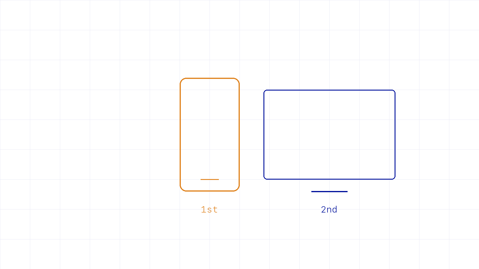
Designing for the small screen first is a forcing function. The phone has no room for anything that’s not essential, so it makes you decide what actually matters before you have the luxury of a wide canvas to hide indecision on. Then the desktop becomes the easy part: you have earned space to give things room, not more space to fill with clutter.
If it works beautifully on a phone, the desktop is nearly free. The reverse is almost never true.
This isn’t a style preference, it’s arithmetic. For most sites the majority of visits are mobile, often the ones landing cold from search or a shared link, exactly the impatient, context-free audience I wrote about in the homepage isn’t the front door. They’re also the ones a heavy page punishes hardest, which is the whole argument of speed is a feature. Designing desktop-first quietly optimizes for the minority.
Make the phone the first screen you design and the first one you test, every time, not the afterthought squeezed in before launch. The discipline it forces will make the whole thing clearer, on every screen. If your site looks great on a monitor and rough on a phone, you’re optimizing for the wrong visitor.
New writing on how the web actually gets built, plus the free pixel wallpaper pack when you subscribe.
Related reading
Tell me about your project. I read every message myself.
Get in touchBased in Manila, working with teams across time zones.