Opinion
Apple made the fold normal
The iPhone Duo won’t put a foldable in most Filipino hands. It puts one in the hands of the people who approve websites, and makes every iPhone app learn to change size.
The iPhone Duo won’t put a foldable in most Filipino hands. It puts one in the hands of the people who approve websites, and makes every iPhone app learn to change size.
In short: Apple’s first fold ships October 23 at $1,999, ₱159,990 here, and it won’t change what most of the country holds. Foldables are still only about 2% of phones. What Apple changed is permission. The fold is now a normal phone shape, iOS apps are required to adapt to it, and the person signing off on your next site will be reading it at a width you’ve probably never checked.
Picture the approval call in six months. Your client opens the staging link on their new iPhone, unfolded, and says it looks great on their phone.
They’re looking at your tablet layout.
Nobody on the call knows, you included, because the screen in their hand is 890 pixels wide. Every site you’ve ever built treats 890 as a small tablet. Close the phone and it’s 466 wide, a phone width no iPhone has had before. The layout they approve is one your users may never see.


Apple announced the iPhone Duo on September 9. A 5.4-inch screen closed, 7.6 inches open, and Apple’s line is the one worth keeping: both displays share the same aspect ratio, “so the experience feels continuous whether iPhone Duo is open or closed.” Split View puts two apps side by side on an iPhone for the first time, including two Safari windows. Pre-orders open October 16, availability starts October 23 in more than 70 countries, and the Philippines is listed as coming soon.
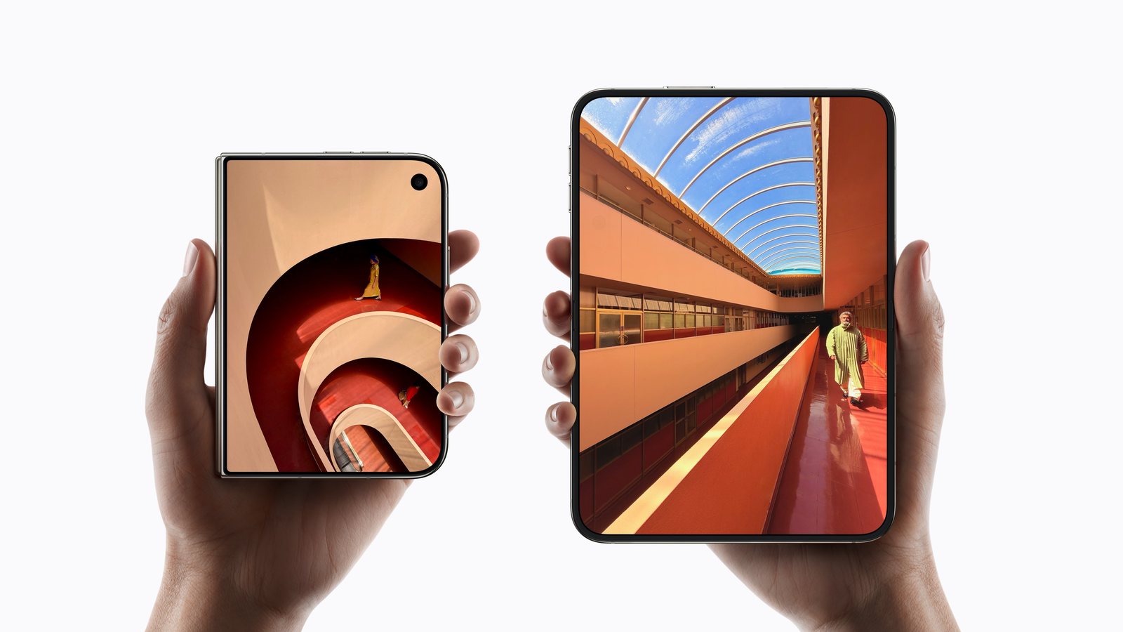
In July I wrote that the story of Samsung’s folds was shape: a near-square browser on the Fold8 Ultra, a wider and shorter passport format on the regular Fold8, and a viewport that changes proportions mid-scroll. Apple’s answer lands closer to the passport than the square. Closed, the Duo is wider than a candy-bar iPhone. Open, it’s the same rectangle turned on its side and roughly twice as wide, so a portrait phone becomes a landscape screen. Samsung got to the passport shape first, and Oppo and Google got there before Samsung. What Apple added is the rule that both screens share one ratio, so opening it changes the size and the orientation, never the shape. I called shape-shifting the story in July. Apple made scale the story, and I think that’s the version that wins, because it asks apps to learn a new size, which is easy, instead of a new shape, which isn’t.
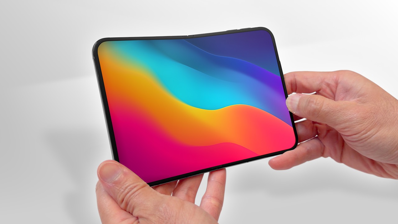
Apple is seven years late to this. Samsung shipped the first Galaxy Fold in 2019, and the Duo arrives against Samsung’s eighth generation. Being late doesn’t seem to have cost Apple the quality argument, though. The reviewers who have held one keep landing on the crease, or the near absence of one. Dave Lee’s first impressions call it the closest thing he has seen to a creaseless foldable, and his ten minutes with the hardware say more about where the category has arrived than any spec sheet. Worth the watch.
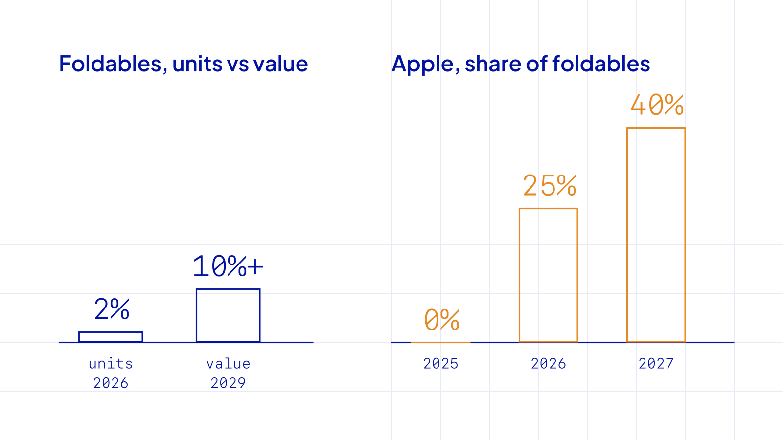
The category numbers are small and the direction is clear. Foldables are still only about 2% of the smartphone market, Counterpoint says, and IDC expects them to stay niche by volume while growing past 10% of smartphone market value by 2029. TrendForce expects Apple to ship roughly 5 million this year, close to a quarter of the fold market, and Counterpoint sees that share reaching about 40% in 2027. Samsung stays the other premium name.
Budget flips have been in Manila for two years. TECNO cut the Phantom V Flip to ₱19,999 in 2024, and Infinix launched the Zero Flip at ₱29,999 that November. So the price floor isn’t the news.
The honest counter is that Android folds outside Apple are expected to fall more than 20% this year on panel costs, and TrendForce reads the Duo’s demand as mostly filling that hole for now. The way I read it, the tip isn’t price. It’s permission. Apple’s stamp makes the fold a normal phone, the premium end stays Apple and Samsung, and the ₱20,000 to ₱35,000 tier fills in behind it as costs ease. I hold that loosely. Analysts have been early on foldables before.
The requirement side isn’t loose at all. The inner screen ignores the orientations an app says it supports. Apple’s guidance is to lay out from size classes, not orientation, to design across a continuum of sizes, and to test in Split View. From April 2027, anything uploaded to App Store Connect has to be built on the iOS 27 SDK.
That’s the part I find remarkable. The native world now has a deadline to do what the web has been asked to do since the first fluid layout: respond to the window you’re given. I haven’t run Hele, my own kids’ app, on the Duo simulator yet. I already have a short list of what to check, starting with everything I sized once and never expected to move.
The web solved this in principle years ago. The practice is where I’d look, because two numbers do a lot of work here.
Closed, the Duo’s browser is 466 pixels wide. In Webflow terms, and in most frameworks, that lands in the mobile-portrait band, so it gets styles that were proportioned for 390. A fluid layout won’t care. Anything with a fixed width will.
Open, it’s 890 by 626, and landscape. That’s the tablet band, 768 to 991. Your client will be reading the site in a layout you designed for an iPad and probably tested least.

Then Split View: two Safari windows side by side, each narrower than the phone was when it was closed. And the fold itself is a live resize, from portrait to landscape. Someone starts your article closed, opens the phone at the third paragraph, and your page reflows in their hand.
Android is about 88% of mobile browsing here, iOS about 12%, and foldables are a sliver of that. A ₱159,990 phone won’t move those numbers.
The 12% isn’t spread evenly, though. It’s concentrated in the offices that approve websites, and that slice upgrades first. So the users stay on the 360 pixel Android, the approver moves to 890, and the gap I wrote about in August just got wider on the approver’s side.
The fix is the same one it’s always been: build for the viewport you’re given and test on the screens your users actually hold. It’s a check my team and I run on every build, and I’m glad to run it on yours.
Apple lists it as coming soon here, priced from ₱159,990, with no local date yet. The first wave of more than 70 countries starts October 23.
Keep 360 as the floor, since it’s the most common Android width in the Philippines, and add 466 and 890 for the Duo closed and open. Then resize the browser live, because a fold is a resize the user performs.
Apple expects apps to be tested in Split View, and the inner screen ignores orientation locks, so an app built for portrait only will show it. From April 2027 App Store uploads must be built on the iOS 27 SDK.
New writing on how the web actually gets built, plus the free pixel wallpaper pack when you subscribe.
Related reading
Tell me about your project. I read every message myself.
Get in touchBased in Manila, working with teams across time zones.