Web Building
Filipinos are mobile-first. Most Philippine websites aren’t.
Filipinos are among the most mobile-native users on earth, but the sites built for them are still approved on iPhones. What the Philippine device data says.

Filipinos are among the most mobile-native users on earth, but the sites built for them are still approved on iPhones. What the Philippine device data says.
In short: Filipinos are among the most mobile-native internet users on the planet. The websites built for them are still designed on a 14-inch laptop and approved on an iPhone. That gap is ours to close, and most of it closes in an afternoon.
Someone is on the jeepney home, phone in one hand, holding the rail with the other. In about ninety seconds they reply to a group chat, send money through an e-wallet, check a delivery, and tap a link from a boosted post because the caption caught them.
That’s a person operating a computer with one thumb, in motion, while doing three other things. The page they just opened is going to spend four seconds deciding whether to show them anything.
We usually tell this story as though the phone were the weak link. They’re the most practiced part of the whole transaction.
Start with the country instead of the browser.
The Philippines held the world’s top spot for time spent on social media for six straight years through 2021, which is where the “social media capital of the world” line comes from. We’re no longer strictly first, though the behavior underneath never changed.
Digital 2026 counts 98 million internet users here and 95.8 million social media identities, about 82% of the population. Then the figure that should reorganize how you build: 97.8% of Filipino internet users go online via a mobile phone. Only 62.7% ever use a computer at all.
Filipinos didn’t lag on desktop. They walked past it. This is one of the furthest-along mobile-only internets anywhere, and it got there years ahead of the markets that wrote the design tutorials most of us learned from.
Filipinos also spend more of the day inside genuinely world-class software than almost anyone. That sets the bar your website gets measured against. Two seconds of hesitation reads as broken, because on everything else they use that day, it would be.
Screens stopped being a single shape a while ago. The Philippine numbers, though, have been steady. I pulled them from StatCounter for July 2026.
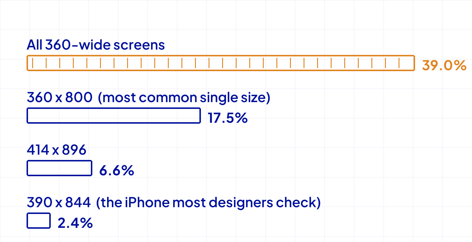
That 360 pixel Android is the Philippine internet. It’s what most of the country is holding, while the 390 pixel iPhone your site was signed off on accounts for roughly one page view in forty.
To be clear about what that number is: iPhones overall are about 12% here. They just spread across half a dozen widths, and the busiest of them is 414 x 896, the XR and 11 era. The screen in your design file isn’t even the common iPhone. We’ve spent years treating the exception as the brief.
Launch prices are moving the other way. OPPO’s Reno16 line arrived here on August 7 starting near ₱45,000. Those aren’t the phones in the data, and the phones in the data are not lesser.
An older Android version does not mainly mean an older browser. Chrome updates itself through the Play Store, so a phone on Android 11 is usually rendering with something current. I’ve watched teams chase CSS support ghosts that were never there.
What the version number really signals is memory and processing headroom, on a device already running a social app, a messaging app, and a music stream while your page loads. Your JavaScript is what notices that. Not your layout.
The phone is busy doing real work for its owner. The website showed up heavy and expected priority.
The 360 pixel Android isn’t the edge case. It’s the country. Our sites are the ones out of step.
None of this is a redesign, and none of it costs anything but attention.
When my team and I audit a site at Dthree Digital, the mobile problems are hardly ever design problems. The design is fine. It was approved on a device almost nobody here is holding, and the wider the audience, the more that costs.
Somewhere on that jeepney, the page either opened or it didn’t. They won’t file a bug report either way. They’ll be gone before the hero image finishes, and your analytics will log it as a bounce, which tells you nothing about why. Let’s talk if you want an honest mobile pass on your site.
360 pixels. It’s the most common single viewport in the country and around 39% of mobile page views once you count its variants.
No. iPhones are about 12% of mobile browsing here. The 2.4% figure is one specific viewport, 390 x 844, the size most design files are built at. iPhones spread across half a dozen widths, and the busiest here is 414 x 896, the XR and 11 generation.
Usually not. Chrome updates independently of the operating system. Read the version number as a signal about memory and processing headroom, not CSS support.
One mainstream Android plus throttled DevTools covers most of it. A shelf of devices is a luxury. A single realistic one is close to necessary.
New writing on how the web actually gets built, plus the free pixel wallpaper pack when you subscribe.
Related reading
Tell me about your project. I read every message myself.
Get in touchBased in Manila, working with teams across time zones.