Opinion
Mobile is no longer a shape
Samsung’s new folds ship a near-square browser, a wide cover screen, and viewports that change shape mid-scroll. Responsive design just stopped meaning phone-sized.
Samsung’s new folds ship a near-square browser, a wide cover screen, and viewports that change shape mid-scroll. Responsive design just stopped meaning phone-sized.
In short: Samsung announced three new foldables at Unpacked this week, and the interesting part is not the hinge. It is the screens. A nearly square 8-inch browser, a wide passport-style cover display, and a 4-inch square that now runs full apps. If your site’s idea of “mobile” is tall and narrow, that idea just expired.
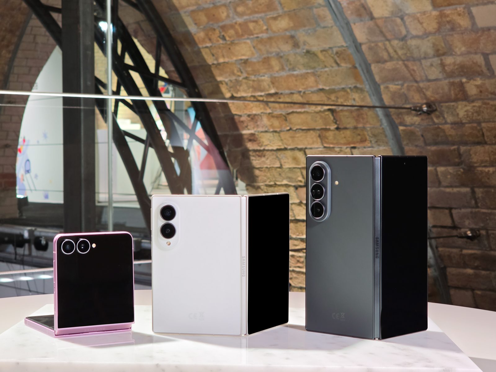
At Unpacked in London on July 22, Samsung introduced the Galaxy Z Fold8 Ultra, the Z Fold8, and the Z Flip8, all shipping August 7. The Ultra opens to an 8-inch inner display and starts at about $2,100. The regular Fold8, at $1,899, is the shape-shifter: a wider, shorter “passport” format whose 5.5-inch cover screen is closer to a small paperback than a candy bar. The Flip8, at $1,199, carries a 4.1-inch cover screen at 1048 by 948 pixels, and Samsung now lets full apps run on it. Under the glass is a new titanium layer that keeps the fold thin enough that people will actually use these open.
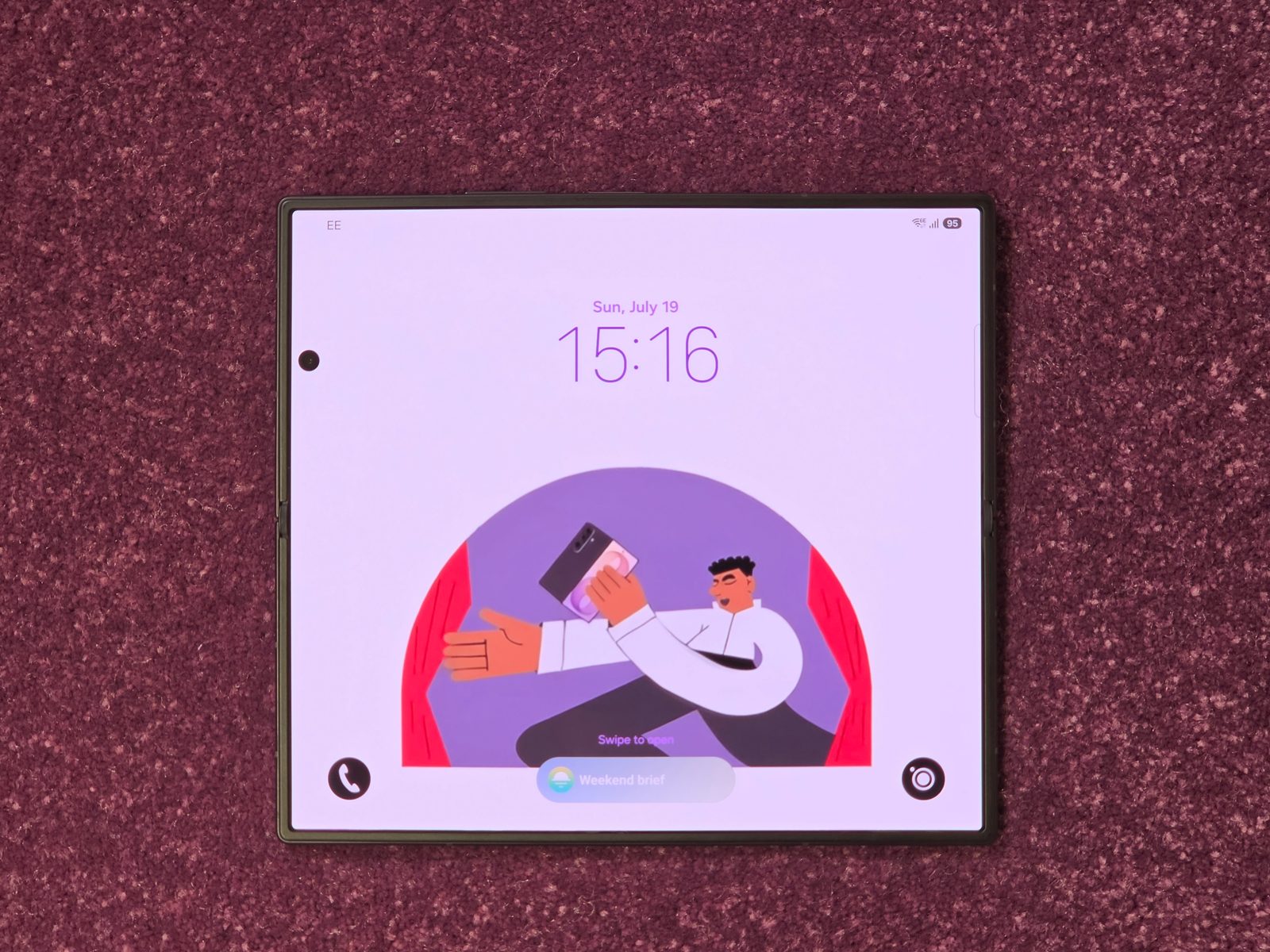
None of these shapes is new, to be fair. The first Galaxy Fold opened to a squarish screen back in 2019, and Oppo’s Find N and Google’s Pixel Fold made the passport format years before Samsung adopted it. What changed this week is scale. Samsung sells foldables in numbers the pioneers never reached, and Apple’s own book-style fold is expected in September at around $2,000. The outlier shapes your analytics used to ignore are becoming the defaults.
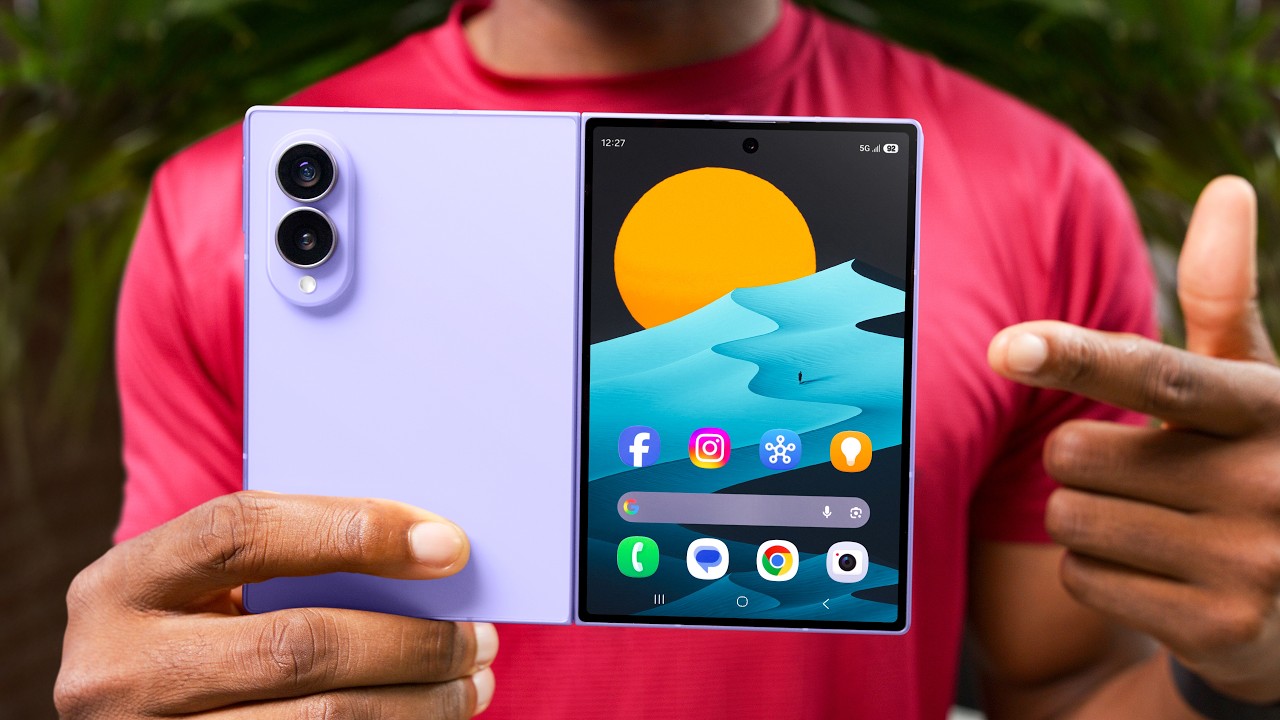
If you want the full hands-on, Marques Brownlee’s early impressions of the wide Fold8 walk the hardware better than any spec sheet, and his conclusion rhymes with the argument here: the shape is the story.
Here is the part that should change how you build. These phones resize the browser while someone is using it. A visitor starts your article on the 5.5-inch cover screen, unfolds to 7.6 inches at the third paragraph, and your layout reflows live, the same way a desktop window does when you drag its corner. Fixed heights snap. Absolutely positioned elements drift. Anything measured once at load, a full-height hero, a column width computed in JavaScript, quietly breaks. Foldables turn every layout into a resize test that real users run dozens of times a day.
The question is no longer “does the site work on mobile?” It is “does the site survive changing shape while someone is reading it?”
Last week I argued that craft is what survives the screen you did not design for. Foldables run the same test from the opposite direction. What survives a square viewport and a live resize is the same short list: structure that makes sense at any width, words that stay clear in one column or two, layouts that flow instead of elements that are pinned. The mobile-first mindset was never really about phones. It was about designing content-out instead of device-in, and this hardware is the proof.
Practically: stop detecting devices and respond to the viewport you are actually given. Prefer fluid grids over fixed columns. Treat viewport-height units with suspicion. And when you test, grab the corner of your desktop browser and drag, because that is what a Fold does to your site all day.
Foldables are still a sliver of Philippine traffic, and at these prices they will stay niche for a while. That is not the point. The point is the direction: screens are multiplying into more shapes, not converging on one. The web’s oldest superpower is that it never belonged to a single screen. A site built on that principle needs no update when the hardware changes. It just reflows.
If your site has not been resize-tested since it launched, that is the check worth running this month. Drag the window and watch what breaks. It is a test my team and I run on every build, and I am glad to run it on yours.
New writing on how the web actually gets built, plus the free pixel wallpaper pack when you subscribe.
Related reading
Tell me about your project. I read every message myself.
Get in touchBased in Manila, working with teams across time zones.