Web Building
Navigation is a promise about what matters
Your nav isn’t a table of contents. It’s a statement of priorities, and most navs quietly say the org chart matters more than the visitor.
Your nav isn’t a table of contents. It’s a statement of priorities, and most navs quietly say the org chart matters more than the visitor.
I once opened a client site whose navigation had eleven top-level items. Each one, it turned out, corresponded to a department that had lobbied for its spot. The nav was a perfect map of the company and a useless map for the visitor, who didn’t know or care how the organization was structured. Every team got its link, and the person actually trying to do something got lost.
Navigation isn’t a table of contents. It’s a promise about what matters, and visitors read it as one.
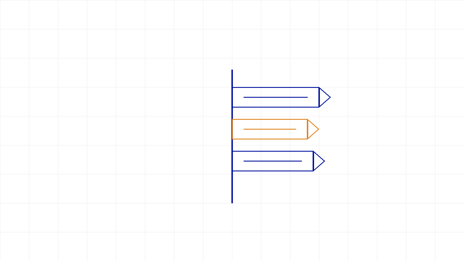
A navigation bar has a strict budget of attention. Add an eleventh item and you haven’t added a choice, you have weakened the other ten. The clarity of a nav comes from what it leaves out as much as what it includes. Deciding what doesn’t go in the top level is the actual work, and it’s uncomfortable, because it means telling someone their thing isn’t a priority for the visitor.
A good nav is mostly a list of things you were brave enough to leave off it.
This is really the same problem as holding the client and the user in tension: the nav that serves the internal politics fails the person it’s for. And it connects to how people actually arrive, often deep in the site with no context, which is why every page has to orient a visitor on its own. The nav is the one element that appears on all of them, so it carries more weight than any single page.
Treat your navigation as a statement of priorities, because that’s how visitors read it. Cut it to the few things that matter most to the person using the site, and have the hard internal conversation about the rest. A nav that says less, clearly, will always outperform one that says everything, faintly. If yours has quietly grown into an org chart, it’s worth rethinking from the visitor in.
New writing on how the web actually gets built, plus the free pixel wallpaper pack when you subscribe.
Related reading
Tell me about your project. I read every message myself.
Get in touchBased in Manila, working with teams across time zones.