Web Building
What we changed for the open iPhone Duo
We rebuilt our agency site for the open iPhone Duo. The same change fixed something more common: wide laptop screens showing one thin column.

We rebuilt our agency site for the open iPhone Duo. The same change fixed something more common: wide laptop screens showing one thin column.
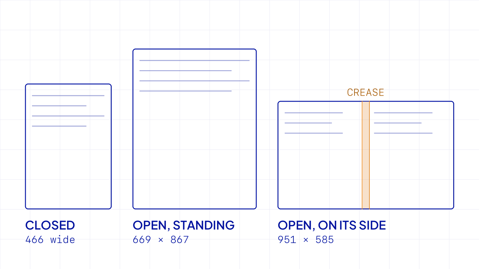
In short: Open, the iPhone Duo shows Safari at 951 by 585 in landscape, the way it opens by default, and 669 wide standing up. Most sites treat both as a small tablet and show one stretched column. On our agency site we gave the open screen its own layout: two panes, the left one pinned, the right one scrolling, with the gap on the crease. The same layout runs on wide desktop screens from 1280 up, which is where most people will actually see it. Hele, my kids’ app, went further and treats the hinge as part of the toy.
When Apple announced the Duo, I wrote that the fold had become normal and that the open screen would be 890 pixels wide. That number came from a third-party spec sheet published before anyone had the device.
In early November we measured it in Apple’s Duo simulator, in Safari, on our own pages. Open and on its side, the page area is 951 by 585. Standing up, it’s 669 by 867. Closed, it’s 466 wide, which the September post did get right. The phone also opens in landscape by default, so 951 is the view most people see first. I have my own Duo now, and the layouts switch where the simulator said they would.
The first layout rule we wrote for the open screen started at 600 wide in landscape. It never matched on the device, and the open Duo kept showing a phone menu at 951 pixels. We’d planned it against the spec numbers, before we had the screen to check.
At 951 wide, most frameworks and most Webflow sites land in the tablet band. You get the tablet layout: one column, centered or pushed to the left, with a lot of screen left over. On a screen you’re holding in two hands, that looks thin. Nothing is broken. It reads like a phone page blown up to fit.

The crease adds a second problem. In landscape it runs down the middle, roughly between pixels 455 and 495. A centered headline or photo sits right across it.
What we built is the pattern you see in Mail or Notes on an iPad: a list and a detail side by side.


We didn’t check for the Duo by name. The layout switches on the screen’s size, with one extra rule: it only applies when the screen is also taller than 480. A regular phone turned sideways is about as wide as the open Duo, but it’s never that tall, so it keeps its phone layout.
The Duo is what made us look, but not many people hold one yet. A 14-inch laptop, or the monitor in a client’s meeting room, had the same problem: one column in the middle and a lot of empty space around it. The same two panes now run there too, from 1280 up. For most of the people who visit our site, that’s the version they’ll meet.
Native apps had less choice. Every iPhone app on the Duo has to take part in Split View and resize with it, and the old setting that let an app insist on the full screen is gone.
For Hele, the music box app I build on the side, I used the hinge itself. Close the Duo and the toy keeps turning on the small cover screen. Open it like a book and the clock stands beside the toy. Stand it like a laptop and the toy sits on the top half, with the brass winding key and stop lever on the bottom half, where your thumbs are.

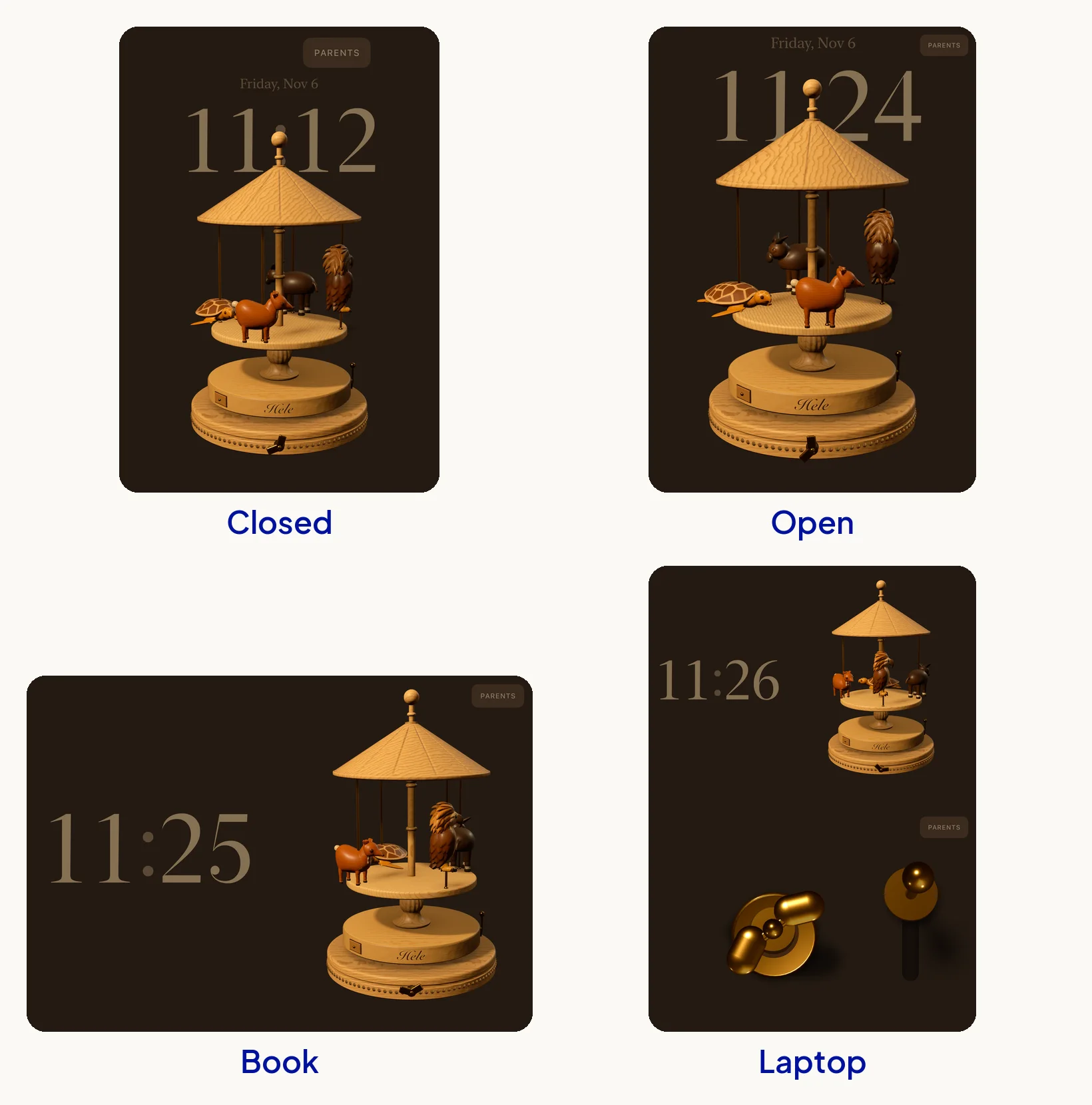
None of that was required. It came from asking what the open screen could be for.
You don’t need a Duo to start. Any desktop browser will do.
If it feels thin at those sizes, the fix is usually a layout decision more than new code: decide what should stay on screen while the rest scrolls, and build around that.
If your site looks thin on the new phones and you’d like a second opinion, send it over. I’d like to see what you’re working on, and the team at Dthree can take a look with you.
Measured in Apple’s simulator in November 2026: 466 wide closed, 669 by 867 open and standing up, and 951 by 585 open in landscape with Safari’s toolbar showing.
Not a separate site. A layout for the 900 to 991 width, limited to screens taller than 480, covers the open Duo in landscape without changing what regular phones see.
Safari draws the page straight across it. In landscape the fold runs down the middle of the screen, so keep text and faces out of the center 40 pixels or so.
New writing on how the web actually gets built, plus the free pixel wallpaper pack when you subscribe.
Related reading
Based in Manila, working with teams across time zones.